

Dataset: (from assignment 2)
The Planetary Exploration Budget Dataset
(https://www.planetary.org/space-policy/planetary-exploration-budget-dataset)
Precondition:
1: Learning
The Planetary Exploration Budget Dataset, prepared by the Planetary Society, enables direct comparisons between past and current planetary exploration efforts by the United States. The problem is that each individual American has a different opinion on how space exploration furthers the cause of science. And those personal opinions may differ drastically from shifting national priorities. The visualization allows a user to compare spending by mission, by year or decade, by destination and by launch costs to get a feel for how their tax dollars were being spent on space exploration. The main hypothesis is even though the Moon has been the stated goal of human spaceflight, it’s really Mars that dominates the planetary desires of the United States which sets the stage for landing humans.
2: Winnowing
Some of the raw data in the dataset include subsets to help explore
 Deploy: Use your visualization with your target data to conduct the tasks you outlined in Step 3. Note your observations about the data gained through these tasks.
- Mission costs
- Funding by destination
- Budget history (by year or decade)
- Major program costs
- 3: Discover
- what task
-
-
- tree
- when task
-
-
-
- select
- aggregate
-
-
4. Design: Create a sketch of your initial prototype. Note that this sketch can be drawn from your work either in Assignment 2 or in the source article, but should include some design iteration to support your target tasks. Add brief design justifications and discussions of the trade-offs of key design choices in the sketch, being sure the discussion is closely tied to your target tasks. Make sure to include a copy of the sketch in your write-up.

sketch
- Implement: Implement your design as a more polished digital or physical data representation. You can use any tool of your choosing, but if you elect to use a WYSIWYG tool like Tableau or Excel, please incorporate design choices beyond the defaults provided by the tool. Note how you’ve implemented your solution, how it addresses your core tasks, and include at least one image of the visualization in the write-up.
- Added icons to make the tree map a little more interesting
- Separated missions (more winnowing and filtering of the dataset) in an attempt to show true increase of missions to destinations over the years.
- Still have not figured out how to make it interactive on a timeline.
- Readjusted the data to show “What” and “When” a little more literally in the dataset. I thought it would be easier to handle and make interactive.
Deploy: Use your visualization with your target data to conduct the tasks you outlined in Step 3. Note your observations about the data gained through these tasks.
-
- To accomplish my goal of adding a timeline, I thought that the data would need to be massaged a bit more into a json structure as follows. This allowed, in my mind, a way of creating the timeline and stepping through each year showing cumulative missions and funding. I was not able to implement this data structure in a working version however.
- It would be a more dynamic visualization to not only add the timeline functionality but also to add a bit of physics in the form of simulation forces. But not necessary for overall story.
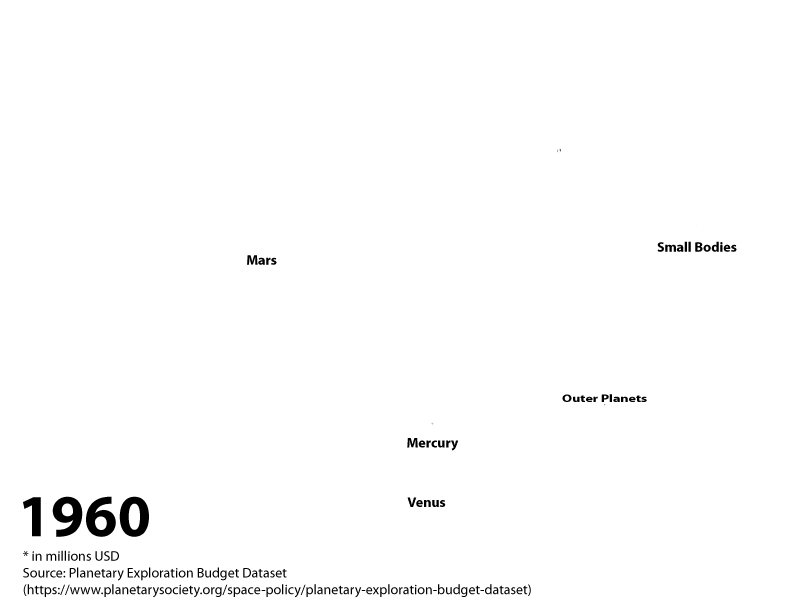
{
      "year": "1960",
    {
      "children": [
        { "destination": "Moon", "missions:" 0, "funding": 256.9773, "cumFunding": 256.9773, "cumMissions": 0  },
        { "destination": "Mars", "missions:" 0, "funding": 0, "cumFunding": 0, "cumMissions": 0  },
        { "destination": "Venus", "missions:" 0, "funding": 0, "cumFunding": 0, "cumMissions": 0  },
        { "destination": "Mercury", "missions:" 0, "funding": 0, "cumFunding": 0, "cumMissions": 0    },
        { "destination": "Outer Planets", "missions:" 0, "funding": 0, "cumFunding": 0, "cumMissions": 0    },
        { "destination": "Small Bodies", "missions:" 0, "funding": 0, "cumFunding": 0, "cumMissions": 0    },
      ]
    },
    "year": "1961",
    {
      "children": [
      { "destination": "Moon", "missions:" 2, "funding": 664.113  },
      { "destination": "Mars", "missions:" 0, "funding": 0 },
      { "destination": "Venus", "missions:" 0, "funding": 0 },
      { "destination": "Mercury", "missions:" 0, "funding": 0  },
      { "destination": "Outer Planets", "missions:" 0, "funding": 0  },
      { "destination": "Small Bodies", "missions:" 0, "funding": 0  },
    ]
}
}
- 7. Iterate: Note at least one new task you’d conduct now that you’ve had a chance to investigate your dataset. Describe how you would change your solution to accommodate that task.
- It would be interesting to explore “How” or “Why” task as related to decadal goals. One way to explore the decadal goals would be to do some extended research (they are not part of the original dataset) to determine what goals were laid out by the planetary science community
- 8. Reflect, Pt 1: Describe what your solution tells you about your target problem. Note that you will do this with your domain expert hat on.
- The target problem is determining if Mars has always been the true standout and goal of the US planetary science program. While exploring the dataset (over each year), it’s clear that once Apollo 11 visited the Moon for the first time in 1969, funding for the Moon stagnated for a time. Mars became the new destination for planetary exploration. For a time, research into Venus was a steady commodity but I suspect that once it was found that Venus’ atmosphere was a hot, dry runaway greenhouse instead of a oceanic, jungle planet interest in the planet waned. It will be interesting to see if the new theories about possible life in the atmosphere of Venus will boost funding in that direction.
- 9. Reflect, Pt2: Describe what your solution tells you about designing visualizations for your target problem. Note that you will do this with your designer hat on.
- From a design standpoint, overall, exploring this dataset over time is a key feature. both visualizations can be tied together; one showing number and kind of missions, the other showing funding. Drilling into the destinations seems to give some insight into how important one planet is over another. I think it might be interesting to create a visualization that broke out orbiters and landers. Mainly this would allow stakeholders to see a cost differentiation between the two. I hypothesize that landers are more expensive because of the added technical challenges and hardware.
